
Figure 3.
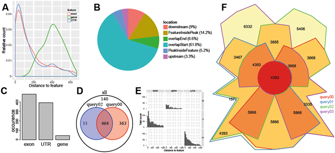
UROPA graphical summary report. (A) The distance to the feature anchor is displayed as a fraction of the total peaks annotated using a density plot. This information can be useful to determine optimal distance settings for annotation. (B) Relative localization of peaks in relation to the annotated feature (one pie chart plot per feature). (C) Bar plot of total occurrence of individual features (one plot per query). (D) All queries are included in a pairwise comparison to show possible overlaps. Assuming multiple concurrent queries, the amount of exclusively and commonly annotated peaks can be deduced. (E) Distance histogram in relation to query and feature where each query is depicted separately. (F) The Chow Ruskey plot represents an area-proportional Venn diagram. It reveals the distribution of peaks that could be annotated per query and works for up to 5 queries.