
Figure 4.
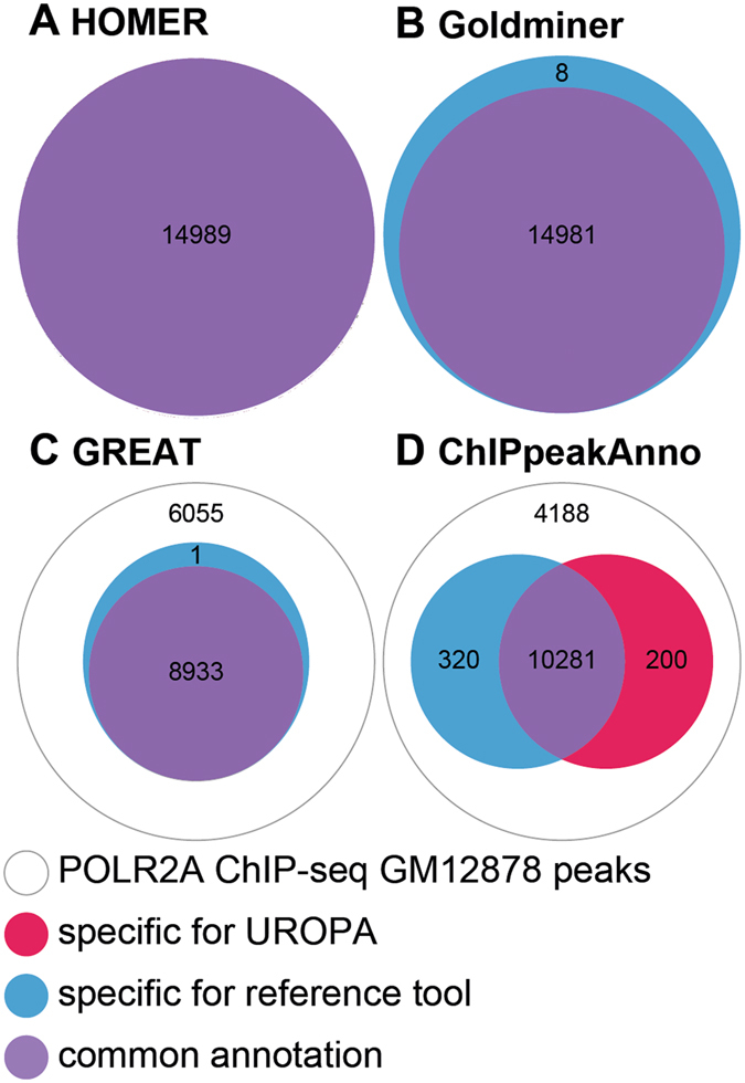
Global comparison of UROPA to other peak annotation tools. White circles represent peaks without any annotation, blue circles represent the number of peaks exclusively annotated by the respective tool, red circles represent peaks exclusively annotated by UROPA, and violet circles represent peaks annotated by both tools. (A) Comparison of UROPA and Homer, no tool specific peaks are reported. (B) Comparison of UROPA and Goldminer. (C) Comparison of UROPA and GREAT. (D) Comparison of UROPA and ChIPpeakAnno.