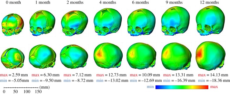
Figure 6.
In silico (B) versus in vivo—three-dimensional distance plots: the blue areas on the plots highlight where the in silico (B) model under-predicted the in vivo CT data and the red areas indicate where the in silico (B) skull over-predicted the geometry of the in vivo CT data. Each skull has been scaled individually with the maximum and minimum values for the colour chart displayed below each age.

