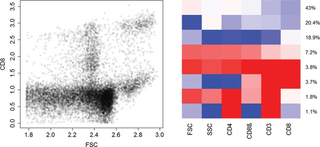
Figure 3.

Flow cytometry dataset GvHD. Scatterplot of two variables (“FSC,” “CD8”) (left-hand side), and heatmap of the clustering results by fitting a sparse hierarchical mixture of mixtures model (right-hand side). In the heatmap, each row represents the location of a six-dimensional cluster, and each column represents a particular marker. The red, white, and blue colors denote high, medium, and low expression, respectively.
