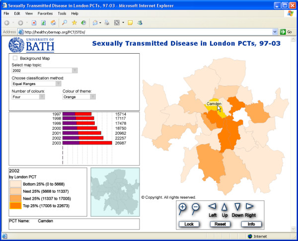
Figure 1.

Screenshot from our interactive Web maps of STD diagnoses by London PCT, 1997 – 2003. Screenshot from our Web-based interactive choropleth maps of diagnoses of STDs by PCT in London for the years from 1997 to 2003 http://healthcybermap.org/PCT/STDs/. The map shown in this screenshot is for the year 2002, with Camden PCT highlighted in yellow. The bar chart ('Chart Panel') on the left shows steadily rising STD rates in Camden PCT over the covered seven-year period. Camden's rates are well above the average for all 25 mapped PCTs over the same period (the purple portions of the bars represent the average for all PCTs). The maps require the free Adobe SVG Viewer http://www.adobe.com/svg/viewer/install/main.html. Visitors will be automatically prompted to download it on their first visit to the site, if they don't already have it installed on their machine. Scripting must also be enabled in Internet Explorer.
