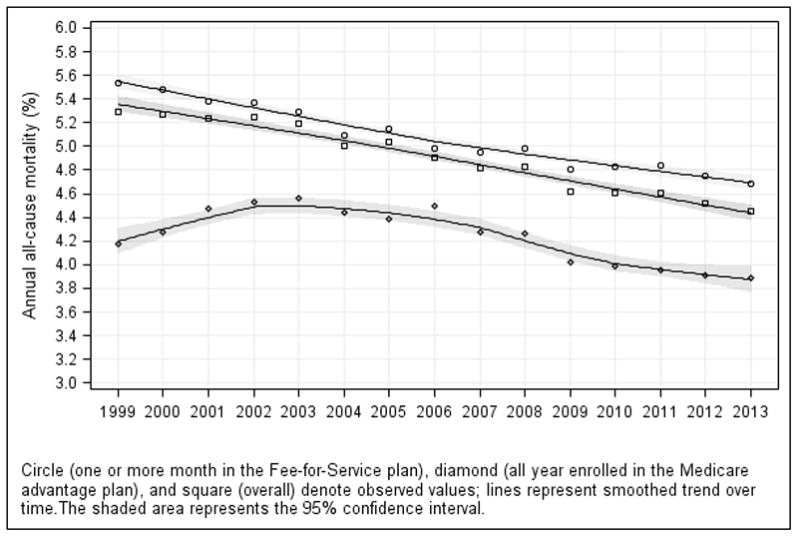
Figure 1. Trends in Observed All-Cause Mortality Rates in the Medicare Population, 1999–2013.

The symbols around each trend line represent the observed mortality rates for each year. All Medicare beneficiaries aged 65 years or older (square), Medicare beneficiaries aged 65 years or older who were enrolled in the Fee-for-Service plan for 1 or more month (circles), as well as Medicare beneficiaries aged 65 years or older who were enrolled in a Medicare Advantage program for the full duration for the year (diamonds) are shown. Lines were smoothed using the loess method (local regression). The numbers of Medicare beneficiaries aged 65 years or older in each year and plan are shown in Table 1.
