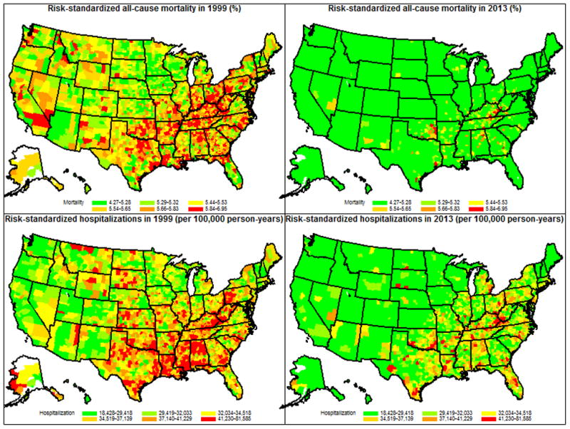
Figure 2. Maps Showing Trends in Risk-Standardized All-Cause Deaths and Hospitalizations among Fee-for-Service Beneficiaries for Individual U.S. Counties in 1999 and 2013.

U.S. counties are shaded according to the risk-standardized all-cause mortality rates (%) (top 2 panels) and the number of risk-standardized hospitalizations (bottom 2 panels) per 100,000 person-years of enrollment in the Medicare Fee-for-Service program: counties with the lowest death and hospitalization rates in 1999 were shaded green, while those with the highest death and hospitalization rates in 1999 were shaded red. Counties are shaded white if there were missing data that precluded the calculation of death, or hospitalization rates. The same legend was used for the panels describing mortality and hospitalization rates in 2013. Both all-cause mortality and hospitalizations were for all beneficiaries enrolled for 1 or more months in Medicare Fee-for-Service. For 1999 and 2013, respectively, there were 27,552,139 and 30,148,234 unique Medicare Fee-for-Service beneficiaries aged 65 or older, representing 26,147,690 and 28,834,706 person-years of enrollment. Data from Puerto Rico were included to estimate the national rates but were not included in the maps. For Puerto Rico, the risk-standardized mortality rate decreased from 4.97% (95% CI 4.91 to 5.04) in 1999 to 3.64 (95% CI 3.55 to 3.73) in 2013; the risk-standardized hospitalization rate per 100,000 person-years decreased from 29,038 (95% CI 27,891 to 30,184) in 1999 to 17,432 (95% CI 16,775 to 18,089) in 2013.
