
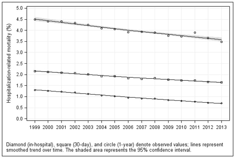
Figure 3. Trends in Observed (A) Hospitalization Rates and (B) Hospitalization-Related Outcomes in the Medicare Fee-for-Service Population, 1999–2013.
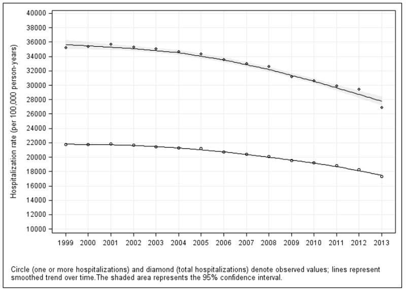
A. Trends in Observed Hospitalization Rates: Rates for 1 or more hospitalizations (circle) and total hospitalizations (diamond) are shown in the figure and Table 3; hospitalizations for major surgical care are shown in Table 3. They all declined over time. The symbols around each trend line represent the observed hospitalization rates for each year. Lines were smoothed using the loess method (local regression).
B: Trends in Observed In-Hospital, 30-Day, and 1-Year Mortality Rates: Among hospitalized patients: In-hospital (diamond), 30-day (square), and 1-year (circle) mortality. The symbols around each trend line represent the observed mortality rates for each year. Lines were smoothed using the loess method (local regression).