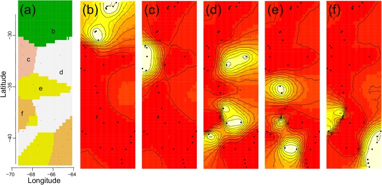
Fig 4. Maps of posterior probabilities of cluster membership based on Geneland analyses.
Panel (a) shows a synthetic map of the mode of the posterior probability distribution for each pixel belonging to each inferred population. Letters (b-f) indicate population labels. Panels (b–f) show maps of the study area with the relative posterior probability of belonging to each of the five inferred populations: black dots represent the geographical position of sampled locations, and lighter colour reflects a higher posterior probability of membership to different clusters.

