
Fig. 3.
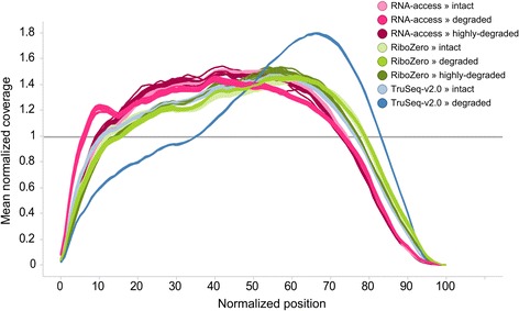
Normalized transcript coverage plot. Plot of the normalized average coverage of the 1000 most expressed transcripts for each sample condition as created by Picard
Official websites use .gov
A
.gov website belongs to an official
government organization in the United States.
Secure .gov websites use HTTPS
A lock (
) or https:// means you've safely
connected to the .gov website. Share sensitive
information only on official, secure websites.
Normalized transcript coverage plot. Plot of the normalized average coverage of the 1000 most expressed transcripts for each sample condition as created by Picard