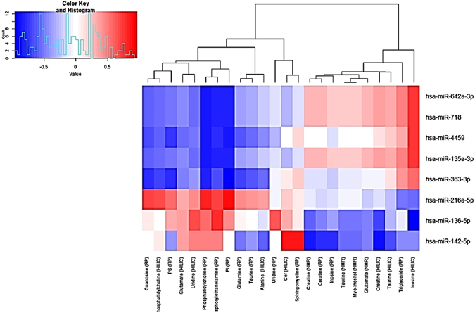
Figure 5.

Correlation heatmap and a dendrogram. A correlation heatmap and a dendrogram of the spearman correlation mapping between the significant metabolites (across the bottom) and the differentially expressed miRNAs (along the right). Areas of intense red colour signify a high level of correlation between the expression of that miRNA and levels of the matching metabolite, whereas blue areas signify anti-correlation. The dendrogram at the top shows correlation distances by clustering the metabolites hierarchically.
