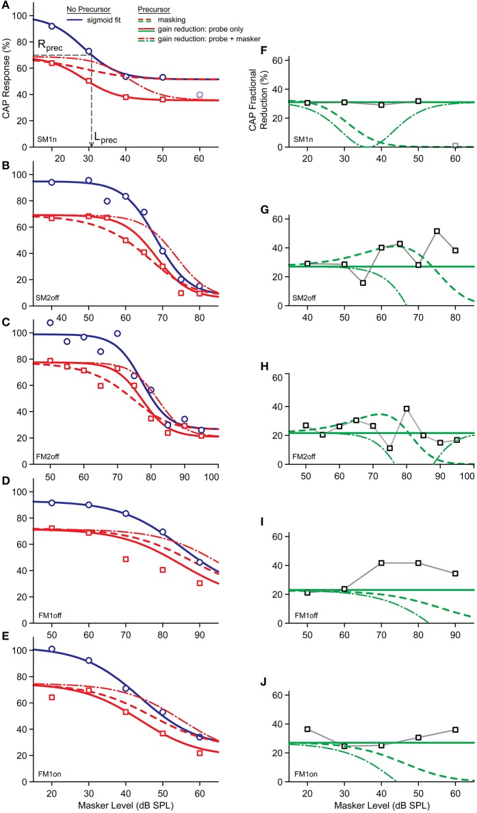
Figure 6.
(A–E) Predicted masked CAP responses in case the reduction by precursor is from masking (dashed red) or due to the activation of the MOCR (solid red). The data points of the masked responses with precursor are indicated by the red squares; those without precursor by the blue dots. These data points were fit by the blue curve, which was used for the predictions. The dashed gray lines indicated the bias level, Lprec. (F–J) Predicted response reductions obtained from the red and blue curves in (A–E). Green dashed curve is for the prediction by masking; the solid green line is the predicted attenuation by the MOCR. The experimental data points are indicated by the black squares.

