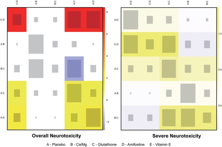
Figure 4.
Heat plot for neurotoxicity treatments. The area of the gray squares displays the contribution of the direct estimate in design d (shown in the column) to the network estimate in design (shown in the row). The colors are associated with the change in inconsistency between direct and indirect evidence (shown in the row) after detaching the effect (shown in the column). Blue colors indicate an increase, and warm colors indicate a decrease (the stronger the intensity of the color, the stronger the change).

