
Fig. 1.
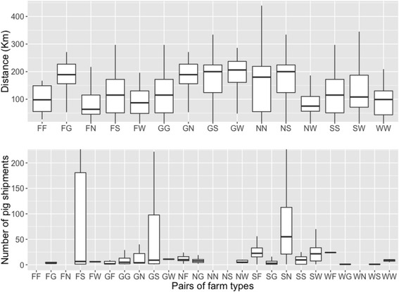
Boxplots illustrating the distance (above) and number of pig shipments (below) between pairs of farm types (where F, G, N, S and W stands for finisher, gilt development units, nursery, sow farm and wean-to-finish, respectively). The first letter indicates the origin of the pigs. Notice that only a small fraction of finishers and wean-to-finish were included in the analyses (i.e., only the ones with PRRS outbreaks) therefore movements from and to those farms are not representative of the total volume of movements in the entire population. The horizontal axis (i.e., pairs of farm types) differs in both charts as the pairwise comparison in distance is symmetric but it is asymmetric in movements (i.e., pig movements FG ≠ GF)