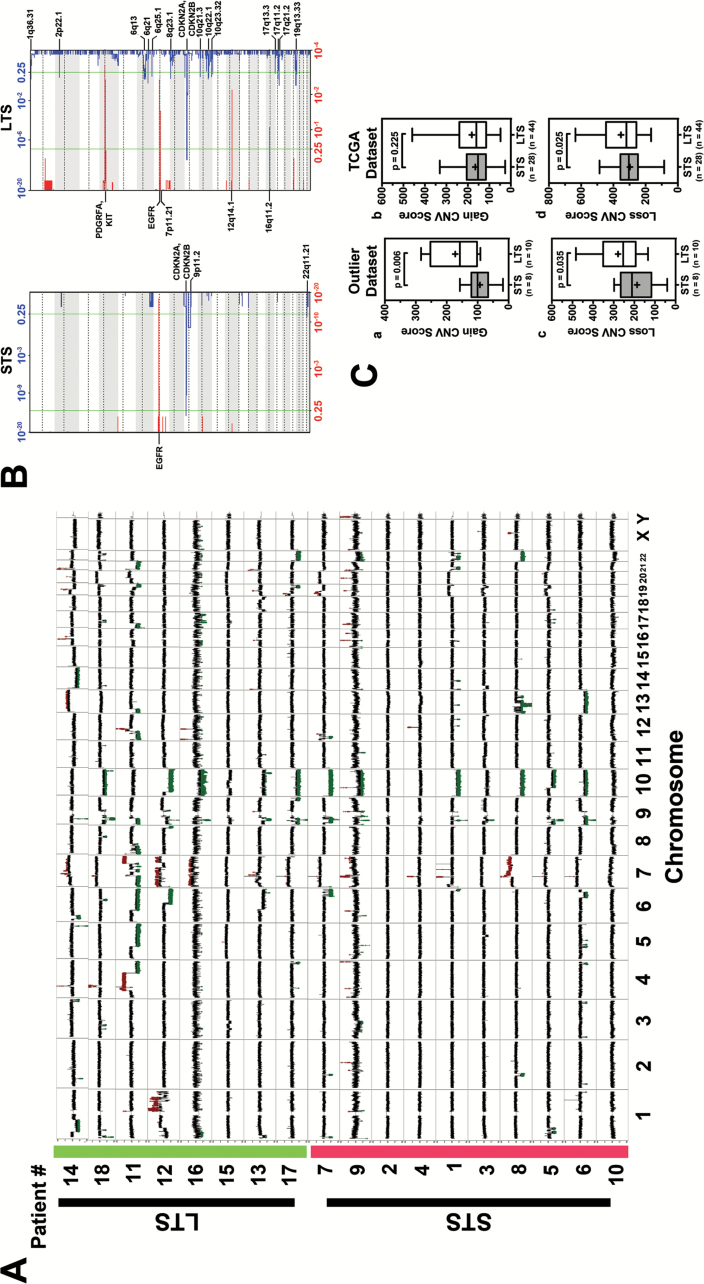
Fig. 2.
(A) CNV compilation plot: LTS are highlighted in green on the y-axis. STS are highlighted in red on the y-axis. X-axis defines the chromosomes. Each sample line represents DNA copy number data as the log2 ratio of normalized coverage in the tumor specimen relative to the matched normal DNA. CNVs can be identified in spikes where the log2 ratio is greater than +0.6 or less than −0.6. Amplifications are marked in red and deletions marked in green. While both cohorts have classic GB CNVs (Chr 7 gain, EGFR amplification, Chr 10 loss) the long-term samples have many more CNV events. (B) GISTIC analysis plot: Each plot shows the frequency of CNVs for each cohort (left: STS right: LTS). In each plot the bottom axis defines the frequency of CNV amplifications in red. The top axis of each plot defines the frequency of CNV deletions. The x-axis of each graph represents the genome with chromosomes marked with alternating white and gray regions. The vertical green bars mark a threshold of significance. Annotations of a variety of significant regions are highlighted in boldface. Q-values for amplified (red) and deleted (blue) regions are displayed along the x-axis on the bottom and top of figures, respectively. (C) Validation of copy number alterations in TCGA dataset. (a&c) Boxplot showing the CNV score of STS (n = 8) and LTS (n = 10) in outlier dataset. (b&d) Boxplot illustrating the difference of CNV score in STS (n = 28) and LTS (n = 44) patients who met the same criteria. P-value was calculated using one-tailed t-test.

