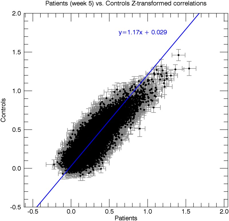
Fig 6. Scatterplot of the resting-state correlations in the patients at week 5 vs. healthy controls.
Every data point in the graph represents an ROI pair, with the x-coordinate indicating the mean Z-score (n = 12) for the correlation between the two ROIs for patients at week 5, and the y-coordinate indicating the mean Z-score between the two ROIs for control subjects. Grey bars indicate the standard error of the mean for patients at week 5 (horizontal bar) and healthy controls (vertical bar). The blue line depicts a straight line fit through the data points.

