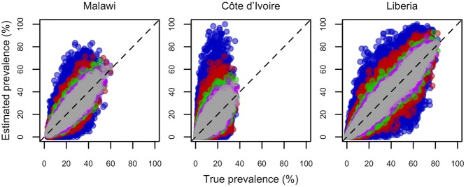
Fig 4. Plots illustrating the relationship between estimated and true schistosomiasis prevalence across 1000 simulated realisations for Malawi, Côte d’Ivoire and Liberia.
All data relate to a sample size of 30 children per school, and colours represent the number of schools sampled per district (blue = 2, red = 5, green = 10, pink = 15, grey = 20). Each dot represents a realisation, and dashed lines indicate perfect correspondence between true and estimated prevalence. Points from surveys of different sizes are overlaid, from smallest (n = 2 schools, blue points at the back) to largest (n = 20 schools, grey points at the front).

