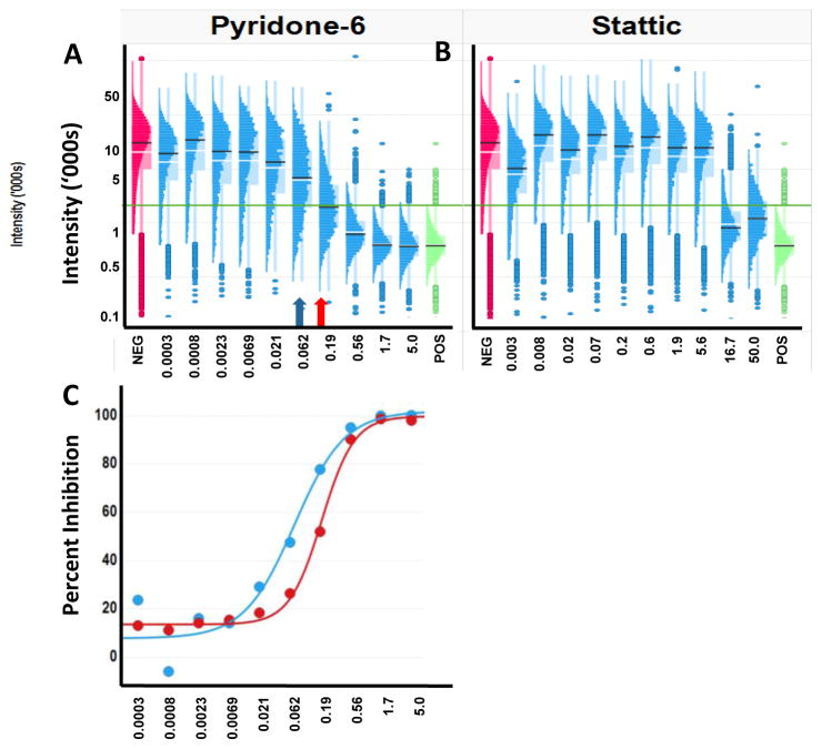
Figure 6. The shape of a dose-response curve can be influenced by the underlying distributions of measurements at each dose.
The distinctive transitions in the populations which may indicate different biological processes. A. Histo-box plots of Pyridone-6 inhibition of IL-6 activated STAT3 shows a gradual inhibition with increasing concentration indicating differential sensitivity of the cells. The mean (white bar) and median (black bar) are shown on the distributions. The negative control (red) and the positive control (green) are shown for reference. The green horizontal line is the 3 standard deviations above the mean of the positive control representing the cut-off between cells with and without activated STAT3. The blue arrow indicates the conventional IC50, while the red arrow indicates the concentration at which 50% of the cells are inhibited. B. Histo-box plots of the inhibition by Stattic shows a much steeper inhibition, indicating a more uniform population response, even though the cells at each dose show a variable sensitivity. C. Dose-response curves for Pyridone-6 inhibition calculated based on the population average (blue) or the percent of cells that were inhibited (red).

