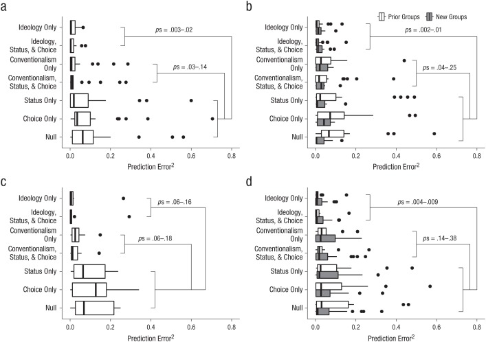
Fig. 3.
Box plots of the seven models’ squared prediction error in (a) Study 1 (23 target groups), (b) Study 2 (35 target groups), (c) Study 3 (9 target groups), and (d) Study 4 (42 target groups). For Studies 1, 2, and 4, results are shown separately for new and original target groups, but because of the small number of target groups in Study 3, results for new and original target groups are combined. In each plot, the right and left edges of the box indicate the 75th and 25th percentiles, respectively, and the black line near the middle of the box is the 50th percentile. The whiskers represent the lowest and highest data points within 1.5 times the interquartile range of the lowest quartile and the highest quartile, respectively. The circles represent outliers. The ranges of p values indicate the values obtained when the two ideology models and the two conventionalism models were compared individually with the status-only, choice-only, and null models.

