
Figure 2.
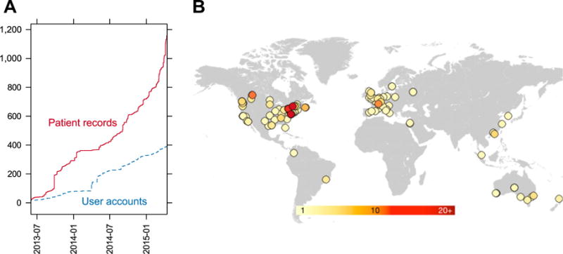
A: The number of patient records (red solid line) and user accounts (blue dashed line) on PhenomeCentral overtime. B: The locations of PhenomeCentral users, estimated from the domain name of institutional email addresses associated with user accounts. The approximate region was identified by querying freegeoip.net with the IP address associated with the domain name of each email address. One point is plotted per domain name, with the color corresponding to the number of users with that domain (the darker the color, the more users with email addresses on that domain).