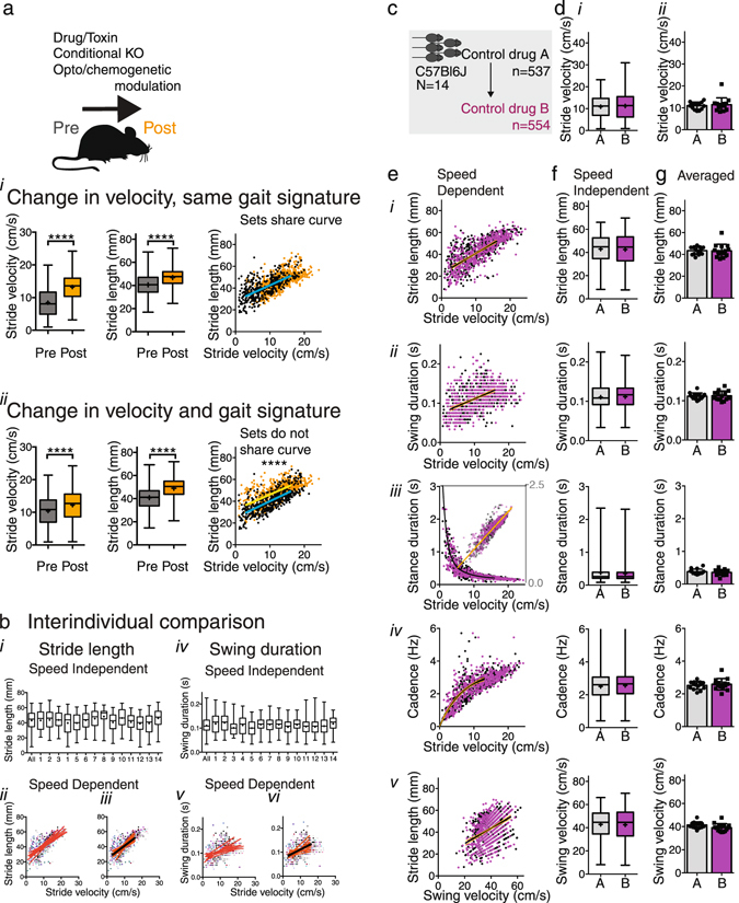
Figure 2.

Regression analysis to compare gait datasets during walking. (a) Hypothetical datasets showing that regression analysis of stride-to-stride gait data in a velocity dependent manner enables assessment of whether one curve fits both baseline and post-interventional datasets. Changes in gait parameters due to velocity-related changes only do not lead to a shift in regression curve (i) whereas changes in gait quality with or without changes in velocity result in a change in slope or Y intercept of the regression curves (ii) representing a change in gait signature. Of note, this approach assumes that mice act as their own control or are compared to litter mates. (b) Comparison of gait parameters among individual animals within a cohort of C57Bl6/J adult males. i and iv: Whisker plots showing little variation between animals(i and iv). Ii-iii and v-vi: Data points (each animal depicted by a different color) and regression curves (orange) represent individual animals for the full velocity range (ii and v) and restricted range (iii and vi) as in Supplementary Table S2. Black curves represent the shared regression line. Note that regression lines overlap especially for the restricted range. (c) Gait parameters were measured in one cohort under 2 control conditions to validate reproducibility. (d) (i): Box and whisker plots show the distribution of stride-to-stride velocity (center representing median, center cross representing mean, bars representing minimum and maximum; Mann Whitney Rank test, Supplementary Table S3). (ii) bar graphs with scatter plots represent average stride velocity (2-tailed t-test), with error bars indicating standard deviation. (e) Relationships of stride length (i), swing duration (ii), stance duration (iii), and cadence (iv) as a function of stride velocity, and of stride length as a function of swing velocity (v) were captured with non-linear regression models (Supplementary Table S2). The fit of one curve to both data sets was compared with the fit of individual curves fit to each dataset (Supplementary Table S3). Orange lines represent 95% confidence intervals. (f) (i-v) and g (i-v): Stride-to-stride data represented as whisker plots (Mann Whitney Rank test, Supplementary Table S3; bars indicate maximum and minimum) and bar graphs with scatter plots represent averaged data (paired 2-tailed t-test, Supplementary Table S3; error bars indicate standard deviation).
