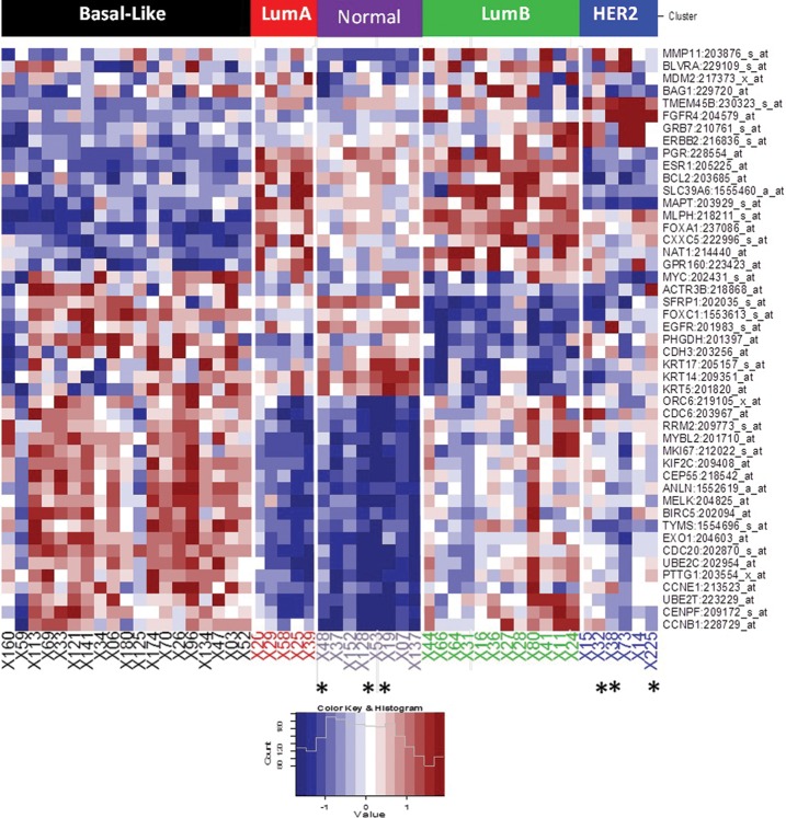
Figure 2.
Molecular classification using PAM50 algorithm. Heat map from 50 samples (TNBC and nTNBC). Five different molecular subtypes are at the top of the heat map. Blue represents low gene expression, while red represents high gene expression. In the heat map, each column is for a different patient and each row is for a gene. Asterisk (*) represents TNBC samples according to IHQ analysis that are not in the basal-like subtype.

