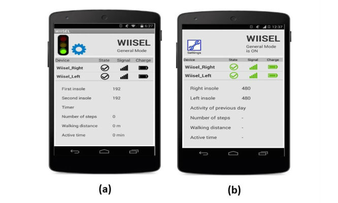
Figure 3.

(a) The old interface showing the system status. Experts did not like the dull colors and crowded interface. Some users did not like the fact that there was no change of colors to indicate low battery, weak signal etc; (b) The updated interface with color indicators for connection, signal strength, and battery life, as well as increased text size and contrast.
