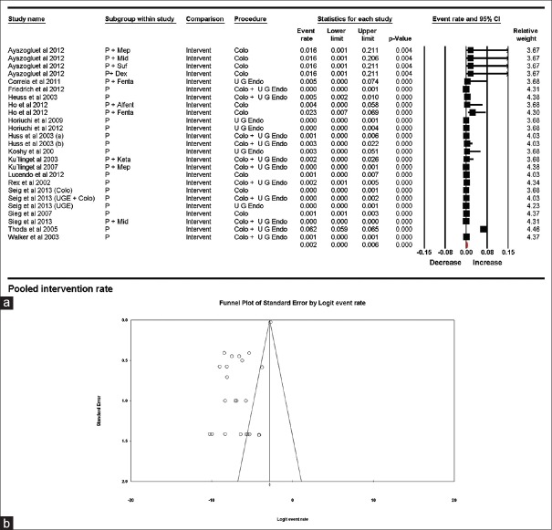
Figure 3.
(a) Pooled airway intervention rates. The diamond (red) at the bottom shows the final net effect with the 95% confidence interval. The line width of individual contributing study/subgroups in the forest plot is proportional to the final effect size. (b) Funnel plot for publication bias in intervention rates showing asymmetrical distribution of published studies demonstrating a possibility of publication bias

