
Figure 6. Regional frequencies of the 100 most abundant T cell clones in different samples of the five PLC patients.
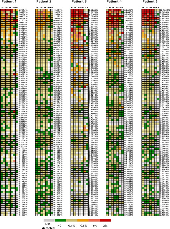
The 100 most abundant TIL clones showed in heat maps identified as the highest regional frequencies throughout five regions of each tumor. Frequencies that listed on the right of each heat map represent the corresponding T cell clones. The color of cell check indicates different frequency of T cell clone, the corresponding relationship between color and clone abundances are indicated by figure legend presents on the bottom of figure. Patient identifications and lesion names are showed on the top of figure.