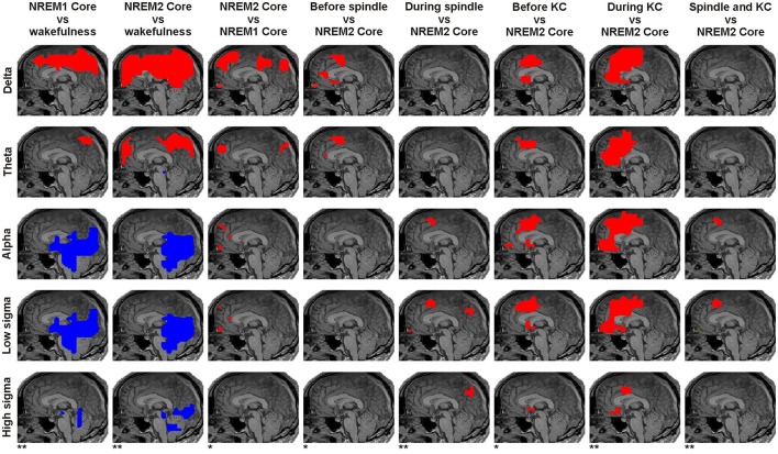
Figure 4.
Panoramic overview of the changes in activity along the midline sagittal cut. Each column shows the result for a different comparison, specified on the title at the top of the column. The changes displayed for each comparison represent common (for all subjects) increases (red) or decreases (blue) in spectral power at the significance level indicated at the bottom of the column: modest changes (p < 0.05) are denoted by one asterisk (*); prominent changes (p < 0.00001) are denoted by a double asterisk (**). Each row represents the result for a different frequency band as printed (vertically) at the beginning (left) of each row.

