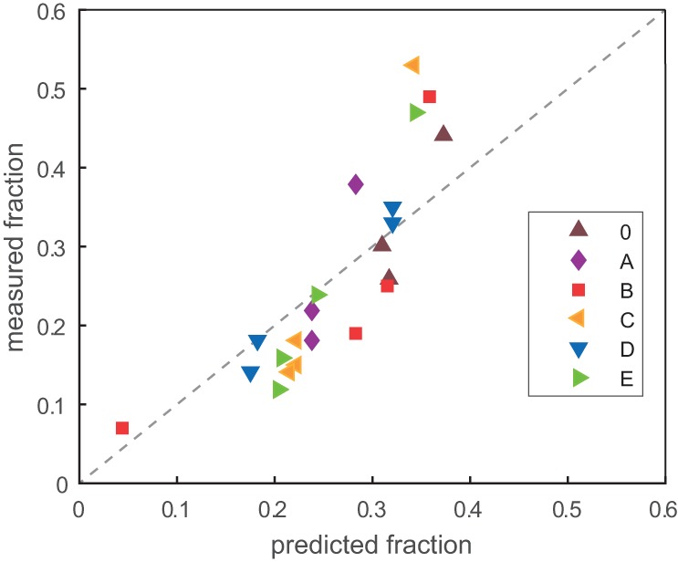
FIGURE 6.

Correlation between measured (y-axis; from Fig. 4) and predicted (x-axis; from Fig. 5) fraction of the total population for genotypes in the evolving networks. Each dot represents a node in a network studied herein, and they are colored by network according to the key. The dotted line represents the perfect correlation of y = x, but as the individual data points are themselves interdependent, calculation of a standard correlation coefficient is not relevant.
