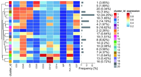
Figure 6. Heatmap of the median marker intensities of the 10 lineage markers across the 20 cell populations obtained with FlowSOM after the metaclustering step with ConsensusClusterPlus (PBMC data).
The color in the heatmap represents the median of the arcsinh, 0-1 transformed marker expression calculated over cells from all the samples, varying from blue for lower expression to red for higher expression. The dendrogram on the left represents the hierarchical similarity between the 20 metaclusters (metric: Euclidean distance; linkage: average). Each cluster has a unique color assigned (bar on the left) which is identical in other visualizations of these 20 clusters (e.g., the UMAP shown in Figure 10) facilitating the figure interpretation. Barplot along the rows (clusters) and values in brackets on the right indicate the relative sizes of clusters.

