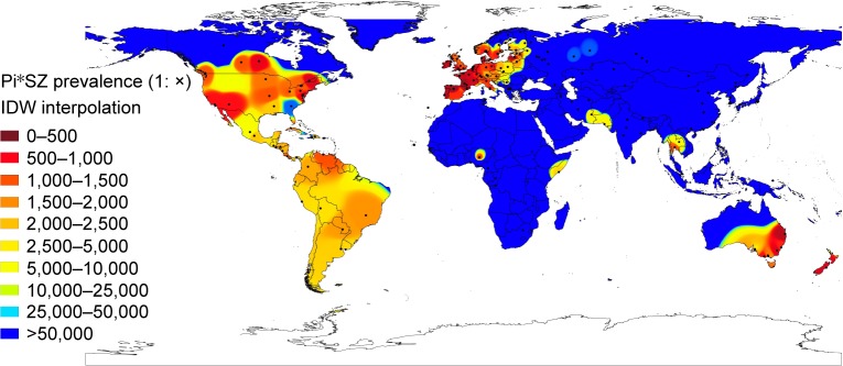
Figure 2.
Distribution of SZ prevalence in the world.
Notes: In this worldwide IDW interpolation map of Pi*SZ prevalence, black points indicate the places where the studies were conducted. The red areas correspond to the regions with the highest prevalences (eg, Europe, large areas of the USA and Canada, southeast Australia, and New Zealand). Yellow areas indicate moderate prevalences (eg, Mexico, Central and South America, and isolated areas of Africa and Southeast Asia). Finally, those colored in blues (such as Africa, Asia, and extreme regions of Europe, North America, and Australia) are regions with very low or nonexistent Pi*SZ prevalence.
Abbreviation: IDW, inverse distance-weighted.

