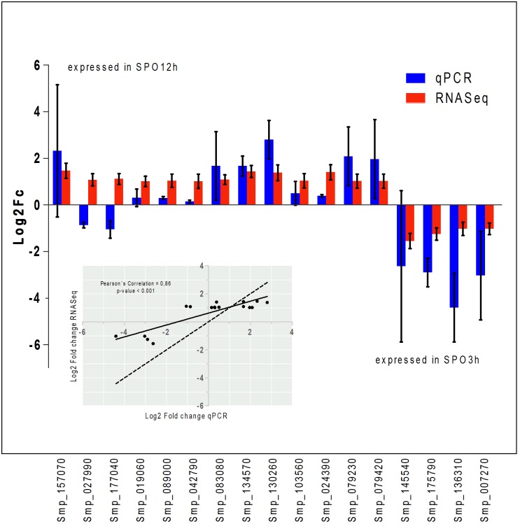
Fig 3. Relative expression of a subset of genes as determined by RNASeq and qPCR assays.
Bar plots of Log2ChangeFold of the subset of genes chosen to validate the RNASeq (red) pattern of expression by using qPCR (blue). The Pearson’s coefficient, at a 95% confidence level is shown on the graph and illustrates the gene expression assessed by both methods. The scatter plot shows the strong correlation of gene expression calculated by the two methods (Pearson’s correlation = 0.86, p-value < 0.001). The solid line is the linear regression adjusted to the points of correlation; the dashed line represents a correlation where x = y.

