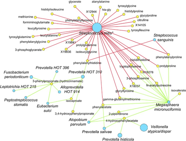
Figure 3.
The network of the most significant Spearman correlations (r<−0.5 or r>0.5) between the top 400 most abundant OTUs and the 493 metabolites. OTUs are shown with blue circles, the diameter of which is proportional to the abundance, metabolites—with yellow circles. Positive correlations are indicated with green lines, whereas negative correlations—with red lines. Taxonomic names marked with * have been truncated for legibility.

