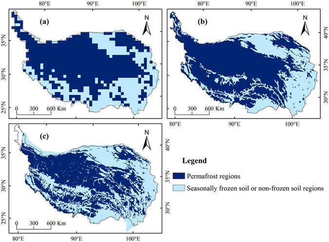
Figure 1.

Comparison of simulated permafrost distribution in the baseline period (1981–2010) with the existing frozen soil maps: (a) Simulated results in the baseline period (1981–2010), (b) frozen soil map from Shi et al.46 (The data set was obtained from Environmental and Ecological Science Data Center for West China, National Natural Science Foundation of China, http://westdc.westgis.ac.cn), and (c) map of permafrost on the QTP from Li and Cheng47 (The data set was obtained from Cold and Arid Regions Sciences Data Center at Lanzhou, http://westdc.westgis.ac.cn). (The figure was created using ArcGIS 10.1 http://www.esri.com/ software).
