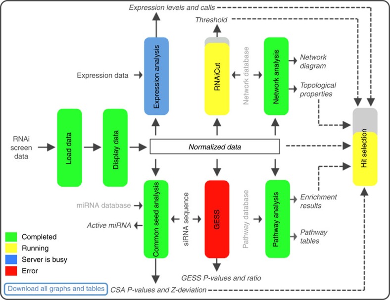
Figure 1. CARD project control panel.
Displays the summary and status of the data analysis pipeline. Different algorithms involved in CARD data analysis are represented as coloured vertical boxes, which can be clicked to access the corresponding analysis page. The colours of the boxes indicate job status. If a job is running, progress is further represented by the coloured fraction of the box. Additional labelling describes data sets related to the screen data, biological knowledge bases used and results obtained from each of the analysis steps. Black or grey font colours represent the data specifically related to the screen or derived from general knowledge bases, respectively. Dashed lines indicate the results from individual analysis used for final hit selection.

