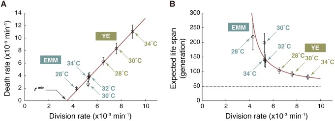
Fig 3. Trade-off between division and death rates.
(A) Relationship between division rates (r) and death rates (k). The red line represents the best linear fit to the data points (open circles) by the least squares method. The error bars represent ±2 standard error ranges (see Materials and methods for the rigorous definitions). (B) Relationship between division rate (r) and expected life span (τd/τb = r/k) of a single-cell lineage. The red line is a theoretical curve based on linear fitting in (A): k = α (r–rmin), where the slope α = (2.0 ± 0.1) × 10−2, and rmin = (3.5 ± 0.2) × 10−3 min-1. The gray broken line represents the minimum expected life span (1/α) in the fast-growth limit. EMM, Edinburgh minimal medium; YE, yeast extract medium. The numerical values for the plots are deposited in the Dryad repository: http://dx.doi.org/10.5061/dryad.s2t5t/15.

