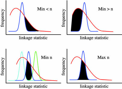
Fig. 1.
Cartoon illustrating the calculation of bounds on complexity. Each curve represents the results of linkage mapping on many highly heritable transcripts. The x axis represents, for a given transcript, the most significant linkage statistic across all loci tested; statistics are ordered by increasing significance. The y axis shows the proportion of transcripts with a given linkage statistic. In each panel, the red curve represents observed data and the blue curve indicates a simulation of transcripts controlled by n additive QTLs of equal effect. (Upper Left) Black shading represents the minimum proportion of real transcripts less complex than the n-locus model. (Upper Right) Black shading represents the minimum proportion of real transcripts more complex than the n-locus model. (Lower Left) Cyan and green curves represent results from simulations of transcripts controlled by n + 1 and n - 1 additive QTLs of equal effect, respectively; black shading represents the proportion of real transcripts consistent with the n-locus model and no other. (Lower Right) Black shading represents the maximum proportion of real transcripts consistent with the n-locus model.

