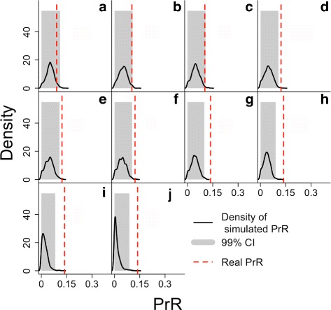
Fig. 4.

The simulated distribution of PrR under the null hypothesis of no PRLS (black curve) with its 99% quantile shaded in grey, and the estimated value for PrR, under 10 scenarios for fecundity. Each plot illustrates the results of the PrR analysis with fecundity smoothed using data-driven regression with a different number of degrees of freedom, from lowest (top left) to highest (bottom right)., a: df=2.1, b: df=2.9, c: df=3.7, d: df=4.5, e: df=5.3, f: df=6.1, g: df=6.9, h: df=7.7, i: df=8.5, j: df=8.9
