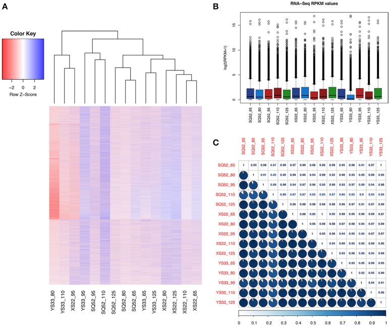
Figure 4.
Comparison of the transcriptomes among the tested SR samples. (A) Heatmap plotting and cluster analysis of 15 SR databases based on the expression pattern and abundance of unigenes; (B) Box plot showing the RPKM distribution of unigenes in the 15 samples; (C) Correlation analysis among samples. The correlation matrix was performed by comparing the values of the whole transcriptome in 15 samples, and Pearson's correlation coefficient among samples was analyzed using R scripts.

