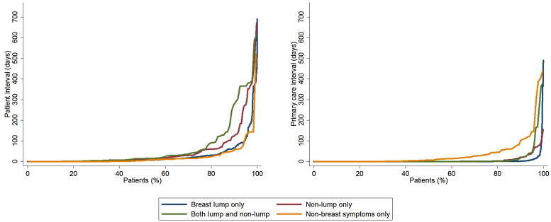
Fig. 2.
Quantile plot distribution of the patient (left) and primary care (right) intervals by symptom group. Note that curves tend to separate towards the upper end of the distribution. Data relate to the four largest presenting symptom groups (see main text). (Please refer to the web version of this article for a colour version.)

