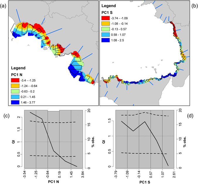
Figure 5.

Environmental correlation of anchovy abundance. Top panels: spatial representation of PC1 scores in the Northern (a) and Southern (b) areas of the Central-Southern Tyrrhenian Sea. Colours represent PC1 scores, according to the ranges identified in QI analysis (bottom panels; c and d). In the northern sector the red and orange sectors represent the most “favourable” areas for anchovy, while the light blue and blue ones represent avoided sectors. Black lines represent the acoustic survey design. Bottom panels: QI analysis results, highlighting the response (selection, avoidance, tolerance) of anchovy population to the identified environmental processes (PCA) in the Northern (c) and Southern (d) areas. Dashed lines identify the upper and lower confidence intervals of the QI curve (solid line). QI values higher than 1 and above the upper confidence interval identify a “selective” behaviour, while QI values lower than 1 and below the lower confidence interval indicate “avoidance” behaviour. “Tolerance” behaviour is in between. Maps in Fig. 5 were generated using QGis software v.2 (Quantum GIS Development Team, 2013).
