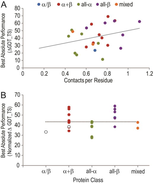
Figure 6. Absolute correct Tc performance improves with increasing provided contacts.

The best absolute performance (top correct Tc GDT_TS – T0max GDT_TS, Y-axis) is plotted against the number of contacts provided per residue in the target (X-axis) in panel (A) and colored according to protein class: α/β (blue), α+β (red), all-α (green), all-β (purple), and mixed (orange). A linear fit to the data has a relatively low goodness of fit R2=0.09. In panel (B) the best absolute performance is normalized by averaging the absolute performance with the expected absolute performance according to the contacts per residue given the linear fit in A. The normalized performance is separated in panel according to protein classes as in panel A. White markers represent data for targets T0806 and T0824 with expected bias in T0. A dashed line indicates the average best absolute performance on all targets.
