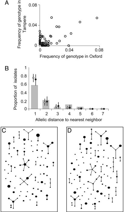
Fig. 3.
Additional tests of the model. (A) To display differences in content between the two S. pneumoniae samples, we plotted the frequency of each genotype (strain) in each sample. (B) The agreement between simulation and data from the S. pneumoniae sample in Oxford was then examined by using the nearest neighbor distribution, defined as the proportion of isolates whose distance to the most similar nonidentical isolate is k = 1... 7, shown plotted as a function of k. Results from the purely neutral model are shown as open circles, and the neutral microepidemic model results are shown as solid circles. The same distribution was plotted for the three other samples in Fig. 6. Differences in fit between the models are slight, reflecting the fact that the greatest difference is an excess of homozygosity, to which the nearest neighbor analysis is relatively insensitive. We also performed eburst analysis of the Oxford data set (C) and a single realization of the neutral microepidemic model (D) simulated by using parameters from Table 1. Each different strain is represented by a point, the size of which is the frequency of the strain. Strains differing at a single locus, which are inferred to be linked by descent, are joined by lines. A summary of the clustering inferred by eburst is shown in Table 2.

