
Fig. 1.
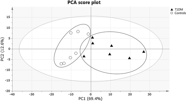
PCA score plot obtained for T1DM patients (filled triangle) and healthy controls (circle). Each participant is represented by its metabolic profile and visualized as a single symbol of which the location is determined by the contributions of the 110 variables in the 1H-NMR spectrum. The PCA score plot shows the first principal component (PC1: 69.4%), explaining the largest variance within the dataset, versus the second principal component (PC2: 12.6%) that explains the second largest variance