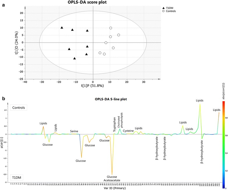
Fig. 2.

OPLS-DA score plot (a) and S-line plot (b) obtained for T1DM patients (filled triangle) and healthy controls (circle). Each participant is represented by its metabolic profile and visualized as a single symbol of which the location is determined by the contributions of the 110 variables in the 1H-NMR spectrum. The OPLS-DA score plot shows the first predictive component (t[1]P: 51.8%), explaining the variation between the groups, versus the first orthogonal component (t[1]O: 24.0%) that explains the variation within the groups. The OPLS-DA S-line plot visualizes differences between T1DM patients (negative) and controls (positive). The left y-axis represents p(ctr)[1], the covariance between a variable and the classification score. It indicates if an increase or decrease of a variable is correlated to the classification score. The magnitude of the covariance is however difficult to interpret since covariance is scale dependent. This means that a high value for the covariance does not necessary imply a strong correlation, as the covariance is also influenced by the intensity of the signal with respect to the noise level. Therefore this measure will likely indicate variables with large signal intensities. The right y-axis shows p(corr)[1], the correlation coefficient between a variable and the classification score (i.e. the normalized covariance). It gives a linear indication of the strength of the correlation. As the correlation is independent of the intensity of the variable, it will be a better measure for the reliability of the variable in the classification process. In b, the red color stands for the highest absolute value of the correlation coefficient. Strongly discriminating variables have a large intensity and large reliability
