Figure 2.
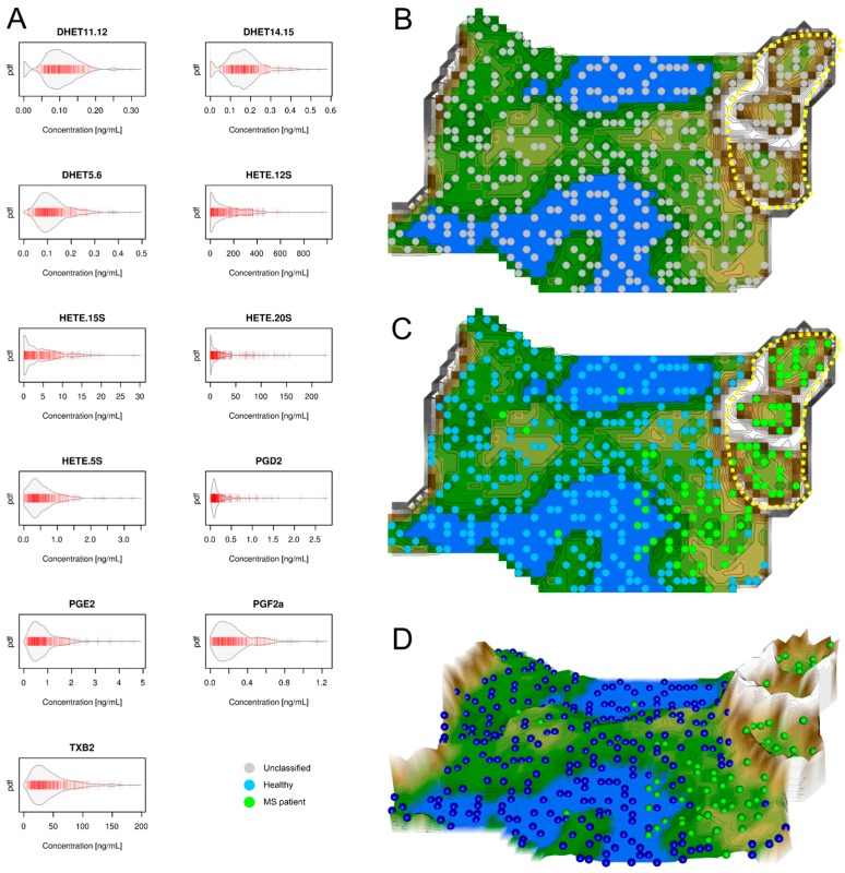
Data structures of eicosanoid serum concentrations: Left part, (A) Serum concentrations of d = 11 eicosanoids (raw data). The data are shown in alphabetical order of lipid mediator names. The beanplots [13] show the individual observations as small lines in a one-dimensional scatter plot, surrounded by a mirrored kernel density estimation of the distributions. Each panel displays a single eicosanoids marker. PGD2 = prostaglandin D2, PGE2 = prostaglandin E2, PGF2a = prostaglandin F2a, TXB2 = thromboxane, DHET = dihydroxyeicosatrienoic acid, HETE = hydroxyeicosatetraenoic acid. Right part: U*-matrix visualization of distance and density based structures of the eicosanoid serum concentration (d = 11 eicosanoid markers) observed in n = 102 multiple sclerosis patients and n = 301 healthy subjects. The figure has been obtained using a projection of the data points onto a toroid grid of 1440 neurons where the opposite edges are connected. The U*-matrix visualization was colored as a top view of a topographic map with brown (up to snow-covered) heights and green valleys with blue lakes. Valleys indicate clusters and watersheds indicate borderlines between different clusters. The dots indicate the so-called “best matching units” (BMUs) of the self-organizing map (SOM), which are those neurons whose weight vectors are most similar to the input. A single neuron can be the BMU for more than one data point or subject, hence, the number of BMUs may not be equal to the number of subjects as in the present case. Differently colored BMUs represent healthy versus MS patient groups; (B) Projection of the markers shown in A onto a self-organizing map. On the raw U*-matrix, the BMUs are colored neutrally (grey). A structure consisting of two clusters emerges. One large cluster and a separate second cluster, which is heterogonous in itself suggesting two subclusters. This region at the upper right part of the U*matrix is marked with a dotted yellow line; (C) Analysis of the agreement between the data set structure and grouping of the cohort. When the group membership to either the MS patients (green dots) or the healthy subjects (blue dots) is projected onto the U*-matrix, it becomes clear that the separate cluster surrounded by the yellow dotted line contains only MS patients. However, patients also are found in the first cluster (the green dots outside the yellow-surrounded region) indicating that the eicosanoids serum concentrations are insufficient to separate patients from healthy subjects; (D) A topographic map of the U-matrix visualization of distance and density based structures of the eicosanoid serum concentrations. It again shows that a fraction of the MS patients is located outside the yellow-surrounded cluster, which is clearly separated from the other cluster by a mountain range. The figure has been created using the R software package (version 3.3.2 for Linux; Available online: http://CRAN.R-project.org/ [14]). Specifically, the beanplots have been drawn using the R package “beanplot” (Kampstra, P.; Available online: https://cran.r-project.org/package=beanplot [13]) and the figures displaying geographical map analogies have been created using our R library “Umatrix” (M. Thrun, F. Lerch, Marburg, Germany, Available online: http://www.uni-marburg.de/fb12/arbeitsgruppen/datenbionik//software; file, Available online: http://www.uni-marburg.de/fb12/arbeitsgruppen/datenbionik//umatrix.tar.gz).

