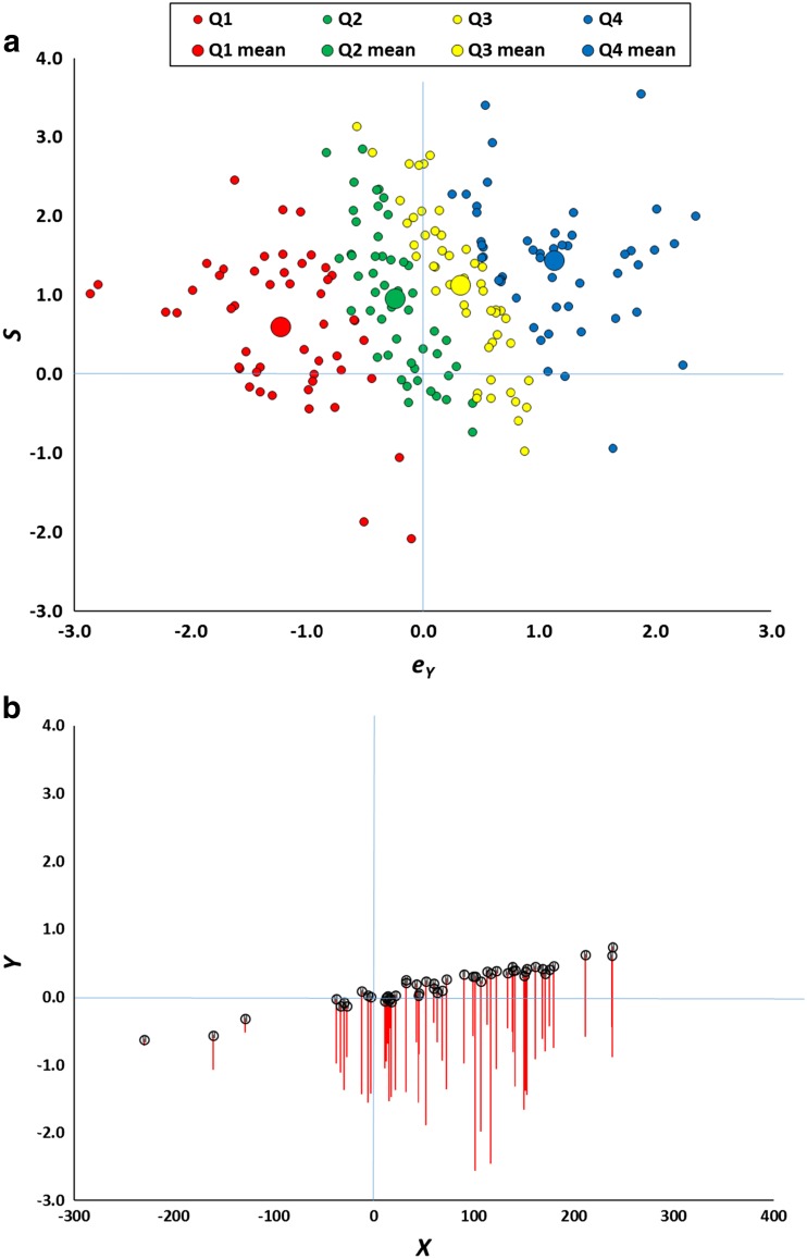
Fig. 3.
a Basis of the regression effect illustrated in Fig. 2. The scatterplot represents the values of S and e Y from Eq. 3 for the data points in Fig. 1a, for the bottom (Q1), second (Q2), third (Q3), and top (Q4) quartiles of Y. Large symbols are the means for each quartile. Although the overall mean value of e Y is zero, for the data points in Q1, the values of e Y are systematically less than zero, while for those in Q4 they are systematically greater than zero. b The figure reproduces all the bottom quartile Y data points from Fig. 1a, but decomposes them into their true score and measurement error. The circles mark where each point would lie if e Y is set to zero. The red line extends to the observed Y when e Y takes its true value. Thus the tip of each red line lies at exactly the same value as depicted in Fig. 1a. (Color figure online)

