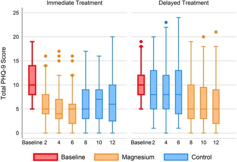
Fig 2. Patient Health Questionnaire-9 over time by group.
The individual box plots show the distribution of PHQ-9 scores by week in each randomization group. The middle line of each box represents the median score. The boxes range from the 25th to the 75th percentile. The whiskers demonstrate the range of scores with outliers shown by small circles.

