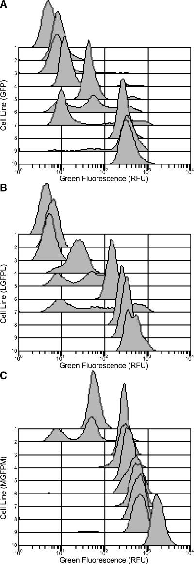
Figure 3.
Green Fluorescence Histograms of Individual Transgenic Cell Lines.
Histograms from each treatment are ordered by their average green fluorescence. For simplicity, only every third histogram, ranked by average green fluorescence (lowest fluorescence, line 1; highest fluorescence, line 10) is displayed. Data shown from replicate 2 only. Green fluorescence histograms from cell lines transformed with the GFP (A), LGFPL (B), and MGFPM (C) T-DNA vectors. Note in (C), the cell line with the second lowest average green fluorescence (line 2) has a mode of cells expressing in the 300 RFU region, but the mode is partially obscured by the histograms plotted below it.

