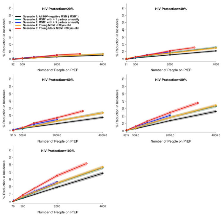
Figure 4. Comparative impact of targeted PrEP scenarios on HIV incidence at various level of HIV protection.
Each panel maps the comparative impact of PrEP scenarios on HIV incidence at a different level of achievable protection under PrEP, ranging from 20% (top left) to 100% (bottom left). The y-axis of each panel shows the percent reduction in incidence under each PrEP scenario at the end of the 5th year of implementation, relative to a baseline with no PrEP. The x-axis represents the number of MSM receiving PrEP in each of five scenarios (described in the inset and the manuscript text). Shaded areas represent the 95% confidence interval around the simulated means. The end of each line represents the total eligible population in each scenario except for scenario 1 (e.g., S3 is continued until the estimated 2000 MSM in Baltimore with more than 5 partners are all covered). For a given number of MSM on PrEP, all targeted scenarios (Scenarios 2–4) show modest improvements over random selection (Scenario 1), and Scenario 5 shows the greatest impact of all strategies evaluated.

