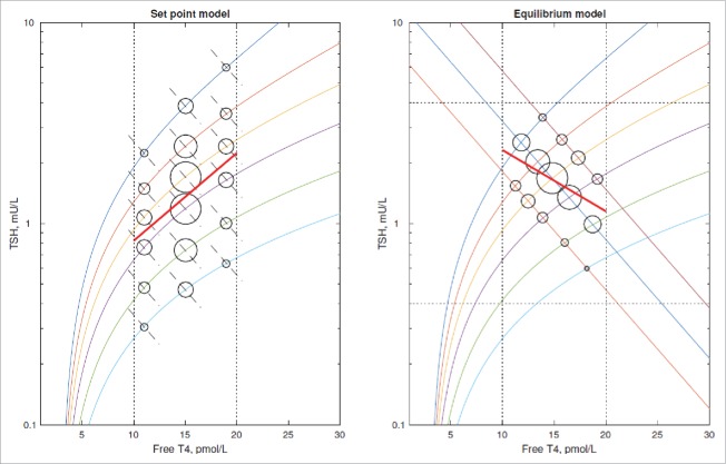
Figure 1.
Comparison of the set point model and equilibrium point model in terms of population distribution of FT4/TSH levels. The area of the circles indicates the number of individuals with FT4/TSH levels at that point i.e., in this case the clustering of individuals around the mean. The multiple lines with a positive slope represent the inter-individual variation in T4 curves and the lines with negative slope represent the inter-individual variation in TSH curves. These latter lines are shown as dashed in the set point model to indicate their ability to be adjusted so as to attain the set point FT4. The set point model implies a line of best fit (bold line) with a positive slope but it is possible for an equilibrium point model to generate a line of best fit with a negative slope.

