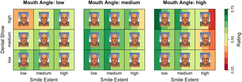
Fig 7. Visualization of the smile effect.
A heat-map plotting the three-way interaction between the smile parameters. The three vertical bars behind each face denote the predicted score for the three response variables: effective, genuine, and pleasant (respectively). Greener colors correspond to better (i.e., higher rated) smiles, and redder colors correspond to worse (i.e., lower rated) smiles.

